To explain that last post, I truthfully dislike Arial font. It irritates me far more than it should. I guess I hate how it looks so weak. It's just I think that the serifs of times new roman or Georgia look for more powerful and formal than Arial. That's all for that topic.
Picture Time!
 |
| Roar! No Math! |
 |
| What is on my Wrist. |
 |
| Signalling. |
 |
| Aiming |
 |
| Looking down the turret. |
 |
| Taking cover. |
 |
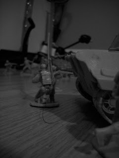
| Radioing in. |
 |
| Rounding the corner. |
 |
| Lobbing. |
 |
| Lobbing in the open. |
 |
| View from behind the tank. |
 |
| From behind the APC. |
 |
| Running. |
No comments:
Post a Comment